Creating an Animated Gauge Chart with Vanilla Javascript
Kara
6 Sep 2018
•
6 min read

My office, like many others, has various lunch and learn events. This week we broke into pairs and created a gauge with vanilla JavaScript. What seemed like a fairly easy task turned into one that was pretty challenging and helped solidify some JS concepts I’ve been having trouble with. Below I’ll walk you through step by step on how my partner and I created our own gauge and some alternate approaches you could take.
Step 1: Creating the arch
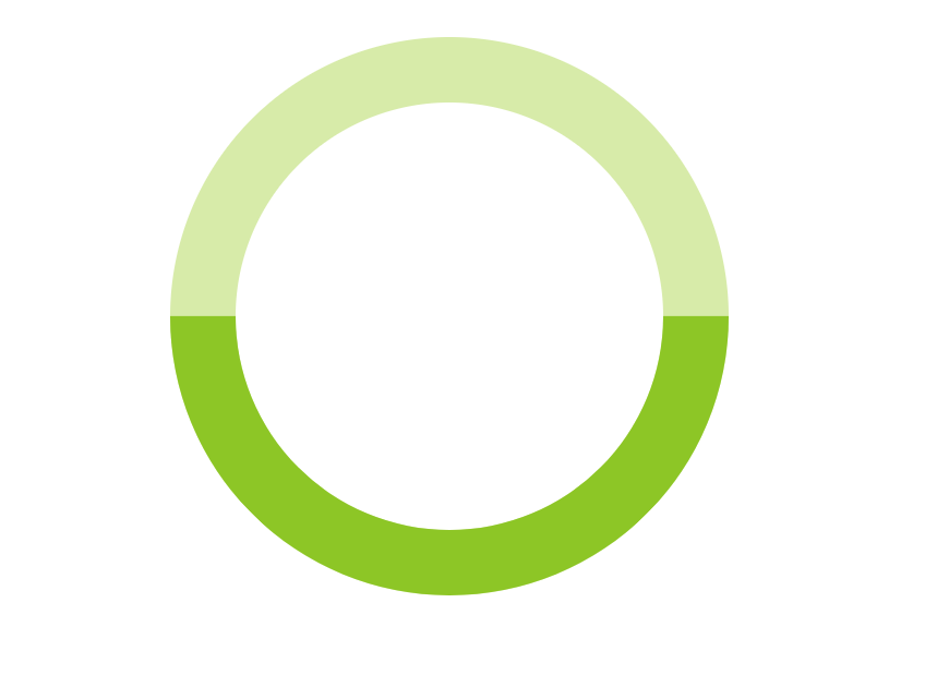
After everyone completed the challenge during our lunch and learn we all presented what we did and it was so interesting seeing everyone’s approach to creating the arch for the gauge. Out of 6 pairings, every single group chose a different way. My partner and I decided to create a transparent circle and add a border which would be the gauge itself.
HTML
<body>
  <div class="loader"></div>
</body>
CSS
*,
*::after,
*::before {
  box-sizing: border-box;
}
body {
  height: 100vh;
}
.loader {
  background: transparent;
  border: 30px solid# D7ECA6;
  border-radius: 50%;
  height: 16rem;
  width: 16rem;
}

The gauge we were trying to make would fill with a darker green color when a random number was selected so we decided to add a before element to our loader div which would be the dark green color.
CSS
*,
*::after,
*::before {
  box-sizing: border-box;
}
body {
  height: 100vh;
}
.loader {
  background: transparent;
  border: 30px solid# D7ECA6;
  border-radius: 50%;
  height: 16rem;
  position: relative;
  width: 16rem;
  &::before {
    content: '';
    border: 30px solid# 8CC800;
    border-left-color: transparent;
    border-radius: 50%;
    border-top-color: transparent;
    height: 16rem;
    left: -30px;
    top: -30px;
    transform: rotate(45deg);
    position: absolute;
    width: 16rem;
    z-index: 2;
  }
}
The reason we went ahead and added a transform: rotate(45deg); on our before element was so that the green progress bar would be sitting on the bottom of our circle instead of slightly tilted which is where the original placement was.
To simplify your code a bit you could remove the before element all together and instead add a border-left-color and a border-bottom-color to your darker green and then set a transform: rotate(45deg) on your loader div. My partner and I didn’t think about that approach until we saw another group that did, but it totally makes sense!
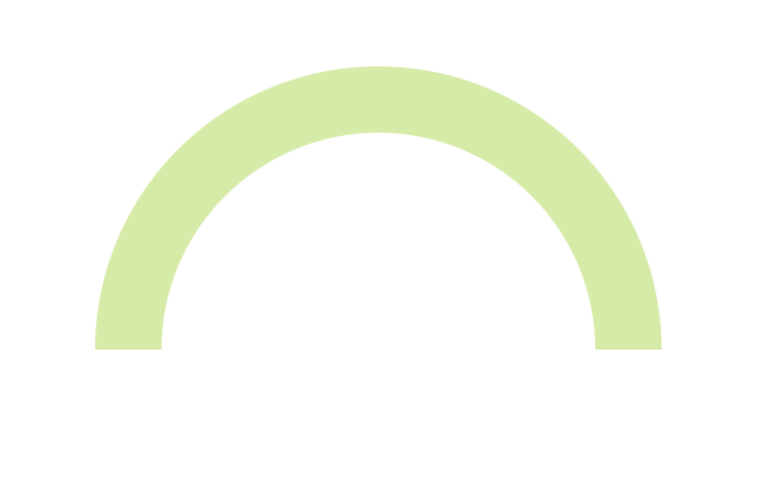
Now for the arch. We wanted to hide the darker green progress bar from being seen so we added a container around our whole loader div. We made sure that the container was the same width as the loader div but was half the height. This was so we could set overflow: hidden on the container and it would hide the darker green border making the gauge look like an arch.
HTML
<body>
 <div class="container">
   <div class="loader"></div>
 </div>
</body>
CSS
*,
*::after,
*::before {
  box-sizing: border-box;
}
body {
  height: 100vh;
}
.container {
  font-family: Arial;
  height: 8rem;
  left: 50%;
  overflow: hidden;
  position: relative;
  top: 50%;
  transform: translate(-50%, -50%);
  width: 16rem;
}
.loader {
  background: transparent;
  border: 30px solid# D7ECA6;
  border-radius: 50%;
  height: 16rem;
  transition: transform .2s ease;
  position: relative;
  width: 16rem;
  &::before {
    content: '';
    border: 30px solid# 8CC800;
    border-left-color: transparent;
    border-radius: 50%;
    border-top-color: transparent;
    height: 16rem;
    left: -30px;
    position: absolute;
    top: -30px;
    transform: rotate(45deg);
    width: 16rem;
    z-index: 2;
  }
}
Step 2: Getting a random number
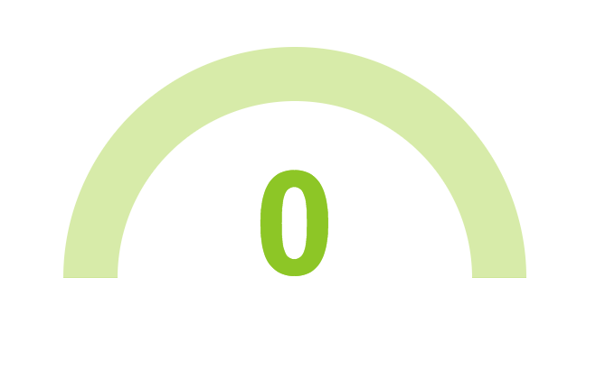
Let’s first hard code our random number and get it centered within our arch.
HTML
<body>
 <div class="container">
   <h1 class="loader__title">0</h1>
   <div class="loader"></div>
 </div>
</body>
CSS
*,
*::after,
*::before {
  box-sizing: border-box;
}
:root {
 --rotation: 0deg;
}
body {
  height: 100vh;
}
.container {
  font-family: Arial;
  height: 8rem;
  left: 50%;
  overflow: hidden;
  position: relative;
  top: 50%;
  transform: translate(-50%, -50%);
  width: 16rem;
}
.loader {
  background: transparent;
  border: 30px solid# D7ECA6;
  border-radius: 50%;
  height: 16rem;
  transition: transform .2s ease;
  position: relative;
  width: 16rem;
  &::before {
    content: '';
    border: 30px solid# 8CC800;
    border-left-color: transparent;
    border-radius: 50%;
    border-top-color: transparent;
    height: 16rem;
    left: -30px;
    position: absolute;
    top: -30px;
    transform: rotate(45deg);
    width: 16rem;
    z-index: 2;
  }
  &__title {
    color:# 8CC800;
    font-size: 5rem;
    left: 50%;
    position: absolute;
    transform: translateX(-50%);
  }
}
To get a randomly generated number, we started out by creating a changeNum()function and calling that inside of a setInterval() method. This would trigger a new random number to be generated every two seconds.
JS
const changeNum = () => {};
setInterval(() => {
  changeNum();
}, 2000);
Let’s break it down: If you’re not familiar with the setInterval() method it calls a function at specified intervals in milliseconds and keeps calling that function until clearInterval() is called or the window is closed. It’s basically the opposite of the setTimeout() method.
We wanted our gauge to grab a random number between 1 and 100. To do this we used the Math.random() method and wrapped that in a Math.round() method so we were getting a number without any decimal points. We also went ahead and set a variable to select the .loader__title h1.
JS
const changeNum = () => {
  const randomNum = Math.round(Math.random() * 100);
  let title = document.querySelector(".loader__title");
};
setInterval(() => {
  changeNum();
}, 2000);
Let’s break it down: The math.random() method returns a number between 0 and 1. We’re multiplying that number by 100 so we then can get a number between 0 and 100. The math.round() method returns the value of a number rounded to the nearest interval. You could also use math.floor() here which would return the largest integer less than or equal to a given number.
Now here’s where some fun things come in. We wanted the number being shown to increment or decrement so we set a variable called currentNumber to grab what number our .loader__title currently showed. We then compared that number to the new random number that was being generated inside of an if statement to figure out if we needed to increment or decrement the number that was being displayed as our .loader__title h1. We originally didn’t have this if statement set inside of another setInterval() method and because of that we weren’t seeing the increase or decrease in numbers because it was happening so fast. Once we set that method we got the effect that we wanted.
JS
const changeNum = () => {
  const randomNum = Math.round(Math.random() * 100);
  let title = document.querySelector(".loader__title");
  let currentNumber = title.innerText;
setInterval(() => {
     if (currentNumber < randomNum) {
      currentNumber++;
      title.innerText = currentNumber;
    } else if (currentNumber > randomNum) {
      currentNumber--;
      title.innerText = currentNumber;
    }
  }, 3);
};
setInterval(() => {
  changeNum();
}, 2000);
Step 3: Indicating our progress with our darker green before element
My partner and I decided to use some CSS variables to rotate our .loader div and have that match up with the random number that’s being generated. We started out by setting our --rotation variable to 0deg and then adding a transform: rotate(var(--rotation)); to our .loader div so when the JS updates the border will rotate to the amount of progress that matches the random number.
CSS
*,
*::after,
*::before {
  box-sizing: border-box;
}
:root {
 --rotation: 0deg;
}
body {
  height: 100vh;
}
.container {
  font-family: Arial;
  height: 8rem;
  left: 50%;
  overflow: hidden;
  position: relative;
  top: 50%;
  transform: translate(-50%, -50%);
  width: 16rem;
}
.loader {
  background: transparent;
  border: 30px solid# D7ECA6;
  border-radius: 50%;
  height: 16rem;
  transition: transform .2s ease;
  transform: rotate(var(--rotation));
  position: relative;
  width: 16rem;
  &::before {
    content: '';
    border: 30px solid# 8CC800;
    border-left-color: transparent;
    border-radius: 50%;
    border-top-color: transparent;
    height: 16rem;
    left: -30px;
    position: absolute;
    top: -30px;
    transform: rotate(45deg);
    width: 16rem;
    z-index: 2;
  }
  &__title {
    color:# 8CC800;
    font-size: 5rem;
    left: 50%;
    position: absolute;
    transform: translateX(-50%);
  }
}
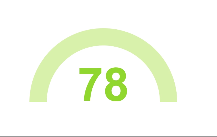
To actually get the number of degrees we needed to turn our '.loader' div we took our randomNum and divided that by 100 and then multiplied that number by 180 degrees. The reason we multiplied by 180 is because if the random number was 100, meaning the darker green before element would be showing 100%, it would need to be rotated a full 180 degrees in order to be fully showing. We then wrapped everything in another Math.round() method to make sure we didn’t have any decimal points. Finally, we set our root variable to update to the number of degrees which would update our CSS variable that we set earlier on the .loader div.
JS
const changeNum = () => {
  const randomNum = Math.round(Math.random() * 100);
  const degrees = Math.round((randomNum / 100) * 180);
  const root = document.querySelector(":root");
  let title = document.querySelector(".loader__title");
  let currentNumber = title.innerText;
setInterval(() => {
     if (currentNumber < randomNum) {
      currentNumber++;
      title.innerText = currentNumber;
    } else if (currentNumber > randomNum) {
      currentNumber--;
      title.innerText = currentNumber;
    }
  }, 3);
root.style.setProperty("--rotation", `${degrees}deg`);
};
setInterval(() => {
  changeNum();
}, 2000);
And that’s it! That was how we went about making a gauge with vanilla JavaScript. After thinking about this challenge a little more I realized that instead of using transform: rotate(); with degrees we could have actually used the CSS turn unit instead which would have made the math a little bit easier to figure out but I still think the way we went about everything was totally fine.
Kara
Former music publicist. Retired ballerina. Nashville Tech Ladies city organizer.
See other articles by Kara

WorksHub
Jobs
Locations
Articles
Ground Floor, Verse Building, 18 Brunswick Place, London, N1 6DZ
108 E 16th Street, New York, NY 10003
Subscribe to our newsletter
Join over 111,000 others and get access to exclusive content, job opportunities and more!